

Before asking a creator to make a product look warmer, darker or more purple, identify the reference you want them to use. Confirm that it represents the item being filmed and that both reviewers are looking at the same video file. A disagreement about the reference or the screen can otherwise become an unclear editing instruction.
Name the reference before judging the color
Identify the actual item being filmed, then ask the brand contact responsible for its appearance to confirm the reference. That might be the supplied physical sample or an image the brand has selected for this purpose. Record its identity and any known limitations. An older campaign photo may be useful for composition while being unsuitable as the color reference. Note the lighting used to view a physical sample as well; its appearance is not independent of the surroundings.
Keep those roles explicit: “Use this image for framing; use the supplied sample when discussing the product’s color.” A fabric swatch only helps if the brand confirms that it represents this product. A similar-looking scrap, a color name or a generated picture does not establish that connection.
If accurate color reproduction is a strict acceptance requirement, agree the production and review method with a team equipped for that work before filming. This article provides a decision record, not a calibration procedure or a guarantee that every viewer will see the same shade.
Separate the file from the way it is viewed
Adobe’s Photoshop guidance explains that devices and viewing conditions can make the same image appear different. Apple also documents that True Tone adapts a supported display to ambient light and Night Shift shifts its colors toward warmer tones. These sources explain possible viewing differences; they do not prove that a particular creator’s export is correct or incorrect.
Before prescribing a color change, identify the exact exported video, the moment being discussed, the viewing device and the app used to open it. Note display settings that affect color and the room lighting. If reviewers are comparing a screenshot, a different export or an older reference, first agree which materials to review.
On supported Apple devices, checking whether True Tone or Night Shift is affecting the display can clarify the discussion. Turning either setting off does not calibrate the screen or make two devices identical. If the difference remains unresolved, ask for a qualified color review instead of repeatedly recoloring the product to suit different screens.
Example: three reasons a purple pouch may look different
Imagine a fictional purple fabric pouch being filmed for a brand. Each row is a separate possible situation involving the same item, not a performed test or a measured comparison. The purpose is to decide what to clarify before requesting an edit.
Fictional product-color decision table
| Situation | Next decision | What remains unresolved |
|---|---|---|
| The supplied pouch and an older campaign photo appear to have different shades. | Ask the responsible brand contact which reference governs this assignment and whether the photo was selected only for its composition. | Do not ask the creator to match the old photo until its color-reference role is confirmed. |
| A product image is supplied without confirmation that it represents the filmed item’s color. | Ask the brand to confirm the image’s purpose and relationship to the actual sample, or provide a suitable reference. | The filename and the word “purple” alone do not settle the target appearance. |
| Two reviewers describe the same export differently on their phones. | Record the file, moment, app and viewing conditions; compare those details before issuing an edit request. | Neither phone is established as a reliable color reference merely because its owner prefers the image. |
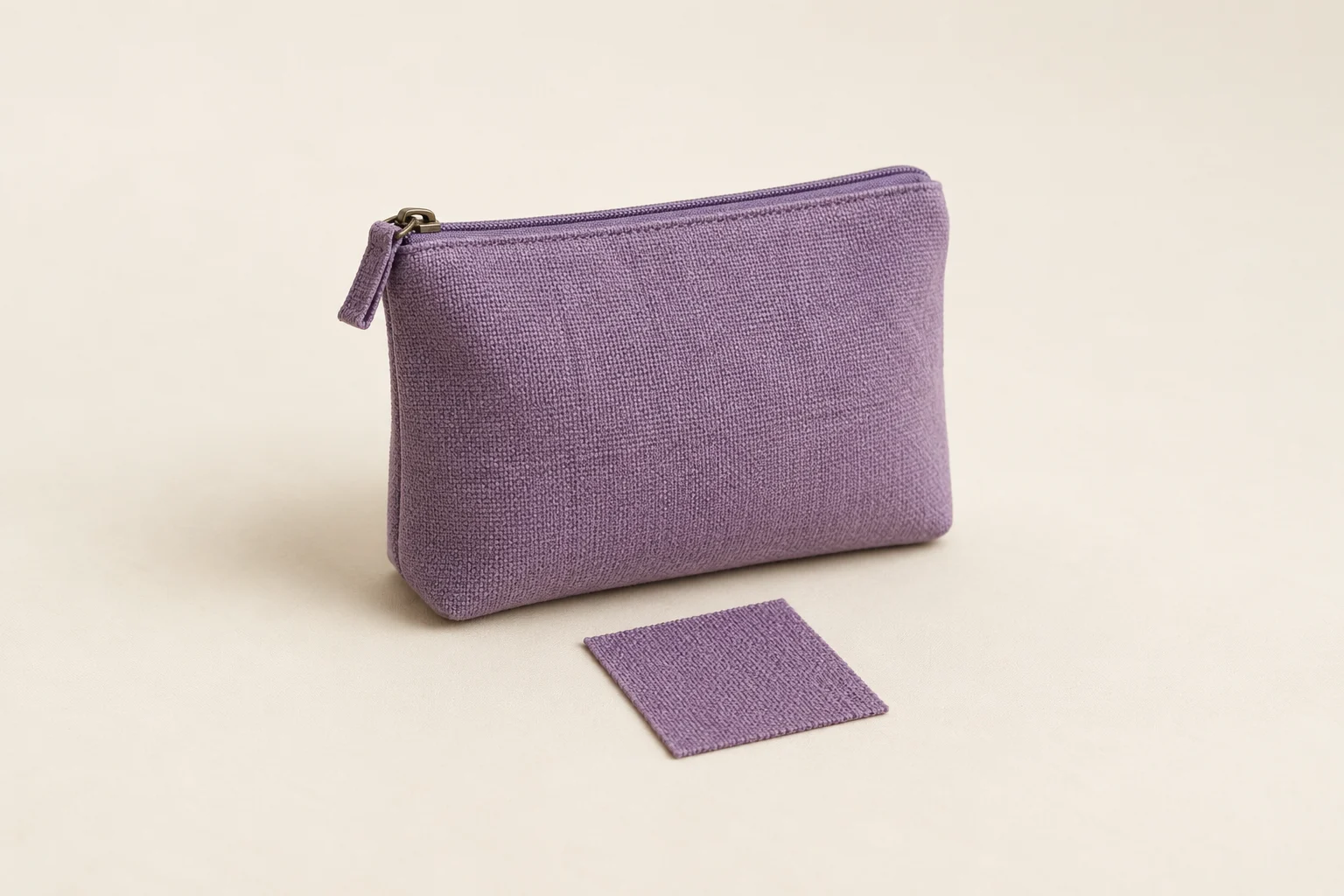
The generated cover illustrates a pouch and fabric swatch. It is not a calibrated comparison, and their pictured appearance does not prove that a real sample matches a real product.
Write a color note the creator can act on
Product-color review note Physical item and identifying details: […] Agreed color reference, its purpose and known limitations: […] Person confirming the reference and date: […] Video file/version and exact moment: […] Device, viewing app, relevant display settings and room lighting: […] Observed difference in the product: […] Unresolved reference or viewing question: […] Agreed next step and person responsible: […] Do not treat a request for clarification as approval of the color.
Describe the visible concern and identify its location: for example, “In this export at the close-up, the pouch appears more blue than the confirmed reference under the recorded review conditions.” That is more useful than “the color is wrong.” Ask the creator to investigate; the note does not identify whether the cause is lighting, editing or display behavior.
When a revised file arrives, review the affected moment against the same agreed reference and record the new file version. If the brand changes the reference, identify that change and discuss its effect on timing and the agreed revision scope. Approval of the product’s color is one decision; it does not approve the rest of the video.